DowntownSeattleParking.com
Redesign of Downtown Seattle’s public transportation mobile website
Downtownseattleparking.com helps drivers locate parking lots with up-to-the-minute parking availability, and information about the free waterfront shuttle. Since launching in 2015, the site had become outdated, with entire sections of the site suffering from usability issues. For example, two main issues were that the “Free Waterfront Shuttle” link was hidden and the address for each stop was missing.
As part of my SVC capstone class, I worked with four UX designers to redesign the mobile website. My focus was the waterfront shuttle.
By the end of 10 weeks, I created a comprehensive user journey map, wireframes, and multiple iterations of prototypes for usability testing.
only 24% of people revisited the site, with a high number of phone calls coming in from users who had questions and complaints.
DESIGN PROCESS
The client's goals were to help people find affordable transportation through the site and to get them over to the downtown core. We ran a study to understand user needs..
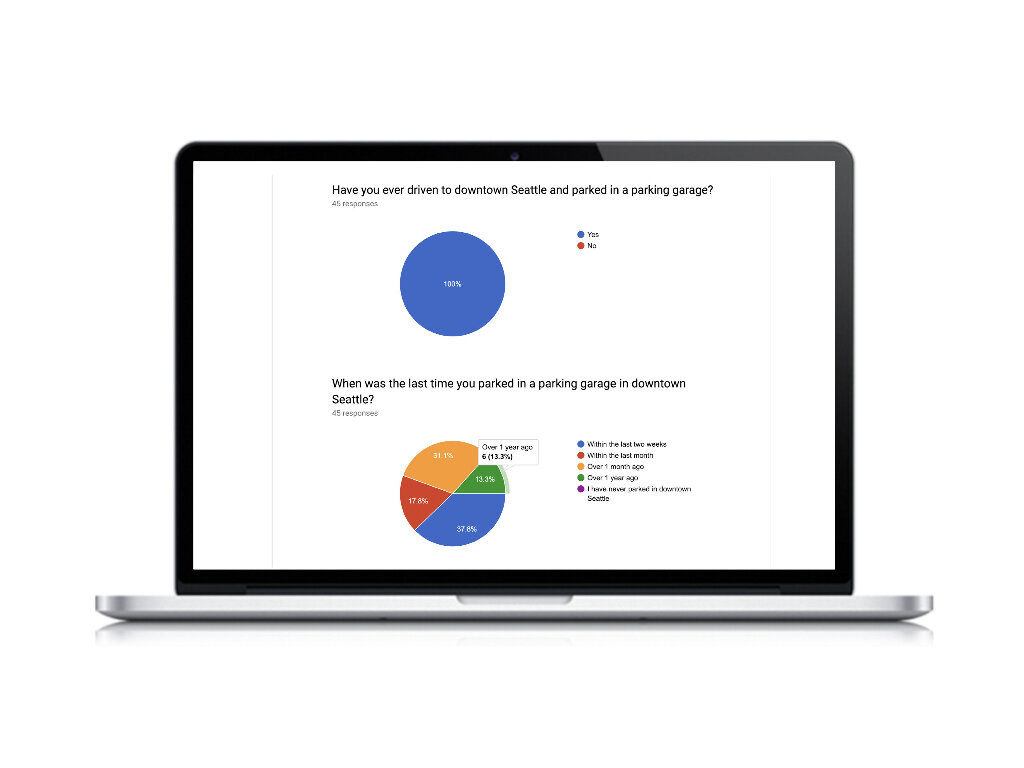
One key finding was that 82% of customers said they usually use Google Maps to find parking instead of a parking app or site. Because of this, we decided to go with a map first approach for the site.
After testing with six users on the current site, I learned that users had three main problems with finding a shuttle:
1. Finding the shuttle section.
Every user struggled to find the waterfront shuttle link on the homepage. The link was hidden on the top of the page and visibly hard to locate as the font was too small and font color too bright with a bright orange background. The shuttle link, shuttle information, and other links were stacked and did not appear as buttons or links.
2. Finding shuttle stops and shuttle tracker on the map.
The shuttle stops on the map didn't have a specific label, so it was hard for users to notice the black dots as stops. The shuttle tracker was also hard to notice as it was labeled as “N/S, and “E.”
3. Navigating the full page with the map sitting in the middle.
Most phones had limited space, causing users to get stuck on the map in the middle of the page. Once you finally bypassed the map then, the list of stops was available at the bottom of the page.
To summarize customer experience, I created a journey map to illustrate each stage of the process.
For my problem set, I identified 12 issues from the survey, user journey, that needed to be solved. To get started, I created a paper prototype and added the following features for parking and the shuttle:
The most complex was to add a list for parking and shuttle with details such as pricing, location, stop, or garage name.
I also added icons on the map that specified each stop so the user can make a connection to the stop list.
Shuttle tracker icon had directional arrows on the map showing which direction the shuttle was heading
Toggle between map to list view.
Filter controls such as “closest” vs “cheapest”.
In the first prototype for the waterfront shuttle, I came up with about 13 improvements to the current site. The shuttle homepage has a easy map-first approach with a stop detail list. Each stop is clearly marked with a specific icon, and I also added a bus icon to track the route on the map.
However, even with these updates, users still couldn’t find the shuttle detail information on the homepage. The directions icon was confusing for users. One study participant asked for an ETA tracker, a suggestion I incorporated into my second prototype.
The second prototype listed details like the distance of the shuttle from each stop and the shuttle schedule. I also moved some shuttle details from the homescreen to the detail page. Now users could see the shuttle schedule, ETA, address, and other necessary information more clearly. The shuttle icons were updated to orange and blue to designate route (Northbound, Southbound, East Loop).
Site Usability Score (SUS)
Current State SUS: 17.5
V1 Prototype SUS: 79.2
Final Prototype SUS: 87.5


